Data Visualizations
The Visualization tab is divided into 4 functional areas:
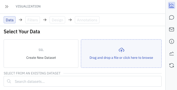
- Data: Selecting the current dataset. This can include data from data warehouses, files (CSV's, Excel), Google Sheets, or internal Writ Datasets (DuckDB).
- Filters: Easy WYSIWYG filters for your data.
- Design: Set the type of visualization. From tables to charts to graphs.
- Annotations: Labels for your visualization.
Adding Data to your Document
To select a dataset, start on the Data tab and select a new or existing dataset. You can also drag and drop a dataset from your local machine.
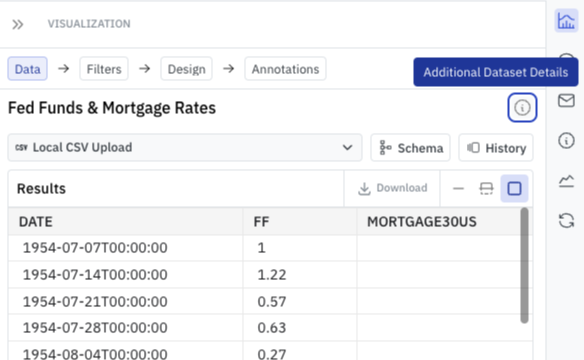
Changing the current Dataset
To change the current dataset, use the Info bubble in the top of the Data tab. From there, you can both rename the current dataset or select a new one.
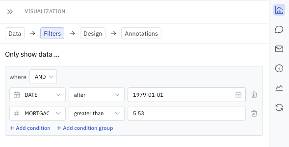
Filtering Data
Both Authors and Viewers can use filters to quickly modify the data being displayed. Such filters are applied after data has been ingested from the source, making it quick to explore various alternatives. Filters can be applied to numeric, text, or date values.
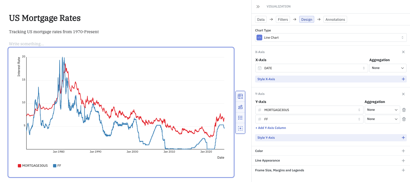
Visualization Design
Writ supports a number of chart types, including tables, indicators (KPI's), and various graphs. Numerous configuration options exist, including adding multiple series, formatting series, creating mutiple cohorts, performing aggregations, and beyond.
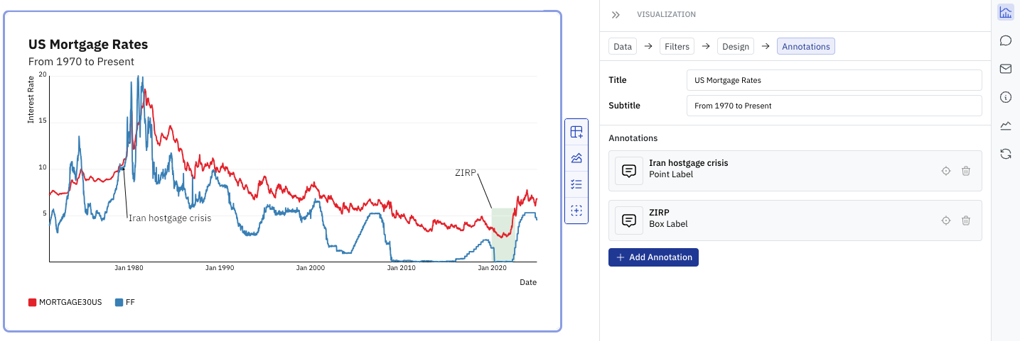
Annotations and Labels
Users can annotate a chart with Box and Point based labels in addition to adding a Title and Subtitle.